Festival designer of 2018

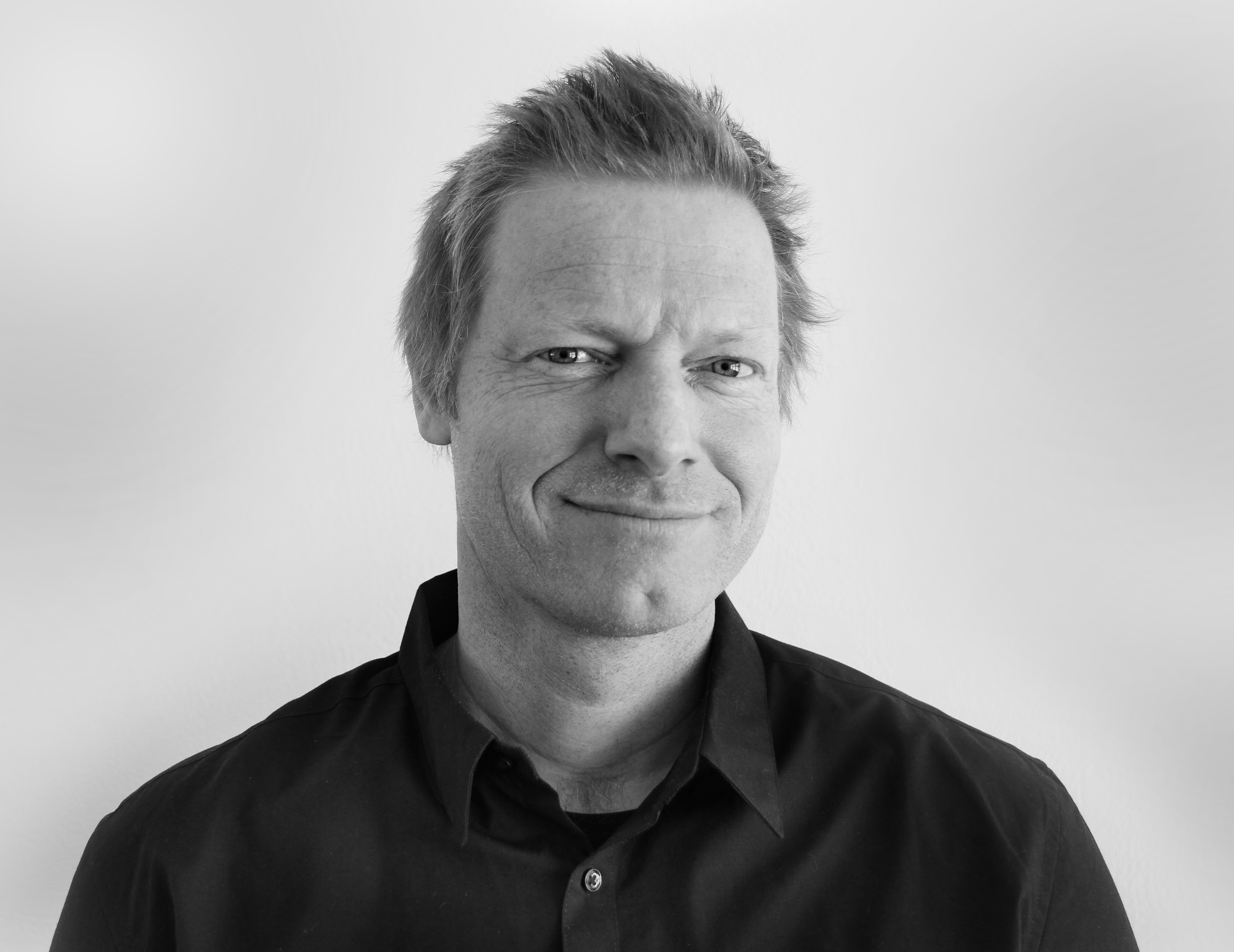
The Arctic and a Northern perspective is once again the theme for the festival design for the Arctic Arts Festival. This year designed by local graphic designer Simen Justdal.
The North Pole is marked by a white cross over a circle shape including pink, green and turquoise, with a yellow background. Around this circle there are a number of circles of different sizes, linked to a network. The circles represent the demographic Arctic, and sizes vary according to how many live in the different areas.
The design for 2018 is a colorful expression, reflecting the people of the North, and the communication and collaboration between Northern people. Festival director Maria Utsi is very pleased and believes the poster is particularly suited for this year's Arctic Arts Festival:
- This is an exceptionally appropriate illustration to our focus in 2018, which this year is about dialogue and cooperation in the north, says Utsi.
Simen Justdal, a freelance designer with substantial experience that has received several awards for his work both at Tank Design in Tromsø and his own company in Oslo, ferniss.no.
- Making the annual festival design for one of the largest cultural festivals in the country has been a great and fun experience. The goal was to make something distinctive with high visibility. I believe we have succeeded with both.
This weekend the poster will color the city yellow, and it will also be possible to purchase festival merchandise inspired by the design when the festival store opens in the city centre on June 9.
Nyhetsarkiv
- 11-12-24
- 27-06-24
- 25-06-24
- 21-06-24
- 17-06-24
- 11-06-24
- 07-06-24
- 22-04-24
- 03-04-24
- 03-04-24